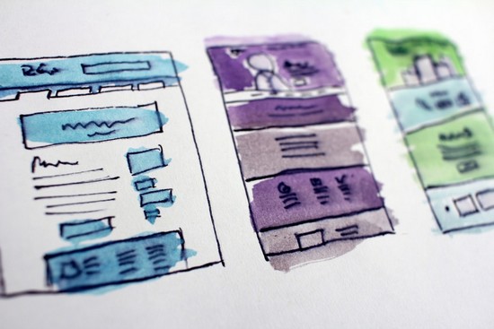
It’s no secret that amazing visual design will impress your website visitors. However, a lot of thought goes into the visual content of a website to ensure that everything looks good and is easy for users to navigate. And it’s not all about how beautiful it looks.
Here are some great design tips you can use to improve your visual content and make your website work well for your business.
Don’t Overwhelm Your Audience With Too Many Choices
Hick’s law states that the more options you offer someone, the longer it will take them to decide. If you overwhelm your audience with too many choices in visual design, you increase the risk of missing a conversion or buying altogether.
This can apply to every aspect of your design, from too many social icons and form fields to adding too many clickable topics and buttons on a single page.
Many marketers will tell you that the best calls to action are those that clearly state what you want from your audience. The same idea applies to your visual design, as they work together to guide members of that audience through your site and along the marketing funnel.
Use a Visual Hierarchy to Guide Users Through Your Site
There’s a reason why most websites include larger fonts for titles, smaller fonts for headers, smaller fonts for text, and even smaller fonts for footers and sidebars. This is done on purpose to guide users through the website and gently nudge them in the right direction.
Not only that, but using a visual hierarchy makes your website easier for people to read, which in turn keeps them on the page longer.
To be realistic, the majority of people who land on your site won’t read the entire page. With the visual hierarchy in place, they can drill down and find the exact information they’re looking for in an easy-to-absorb way.

Don’t Be Afraid of the White Space
When it comes to your website, a simple design is often a more powerful and effective design than a complex and detailed work of art. In a google studies on visual complexity, the results show that visitors are actually less attracted to websites with complex visual designs, and basic websites are perceived as more beautiful.
White space is the name given to the negative space that surrounds elements on your page, such as between text, around images, between page breaks, and more. This can help make your page easier for viewers to read and absorb because it helps reduce the amount of visual clutter on the page.
It also gives your page a clean, organized and sophisticated look that will leave a lasting impression and make your design elements stand out.
Stop Wasting Time on the Carousel Slider
The large carousel slider is a common visual aspect that you see on many websites on the Internet. Many business owners think that because these sliders are popular, they should be included as a focal point on any homepage.
This may have been true a few years ago, but they really aren’t as effective as you might think.
Here’s the truth: only 1% of people actually click on the slider.
If that’s not enough, here are some other fall sliders one can have:
- They can become too distracting for your audience because there are too many places to focus (refer to Hick’s Law)
- Many images can slow down your website load time
- They don’t always render well on mobile
- The slider contributes nothing to your SEO strategy
It’s time to get innovative and stop relying on tactics that add no value to your site’s visual design. With the right items, you’ll be able to make a lasting impression that will keep people coming back for more.


